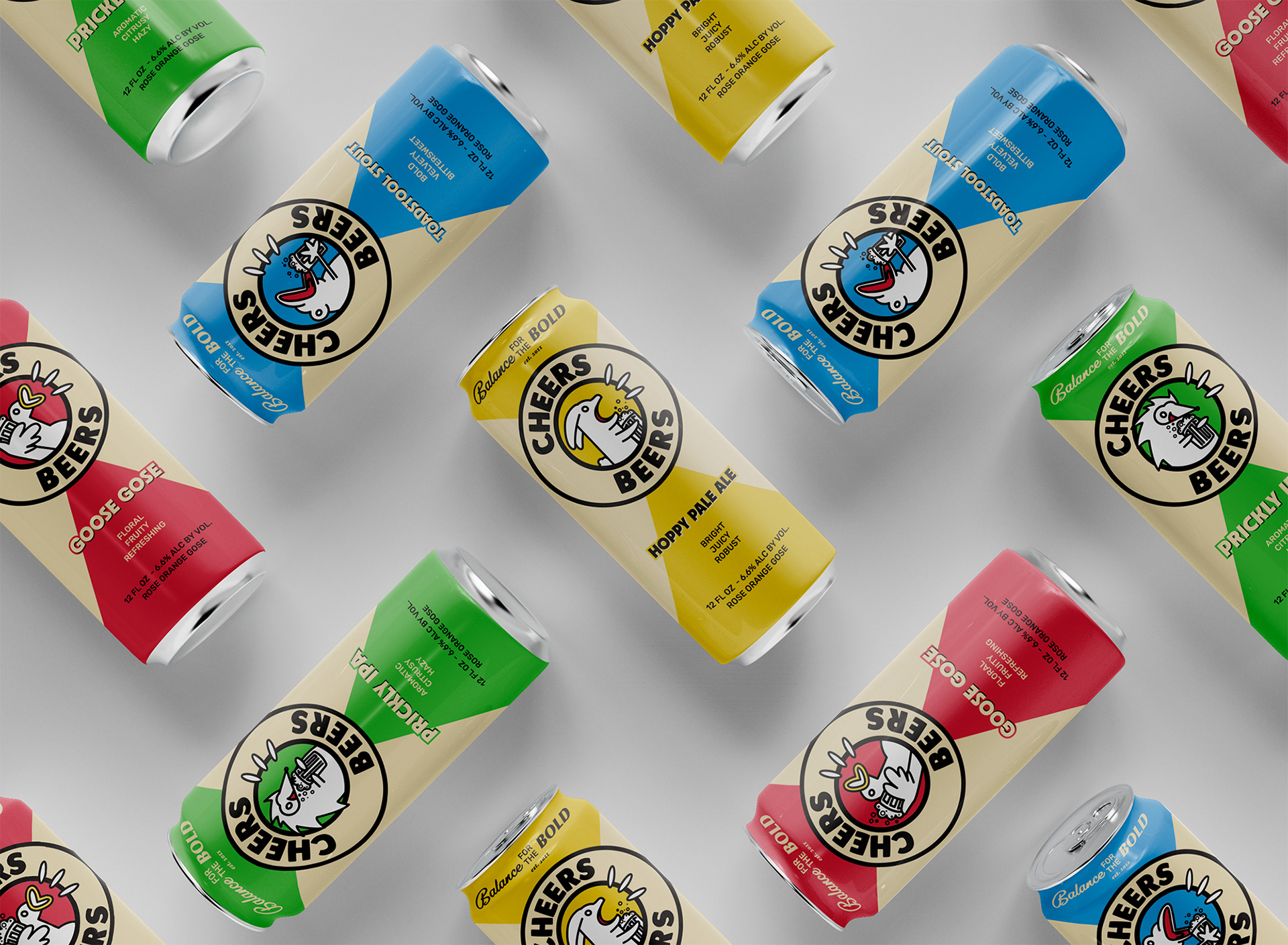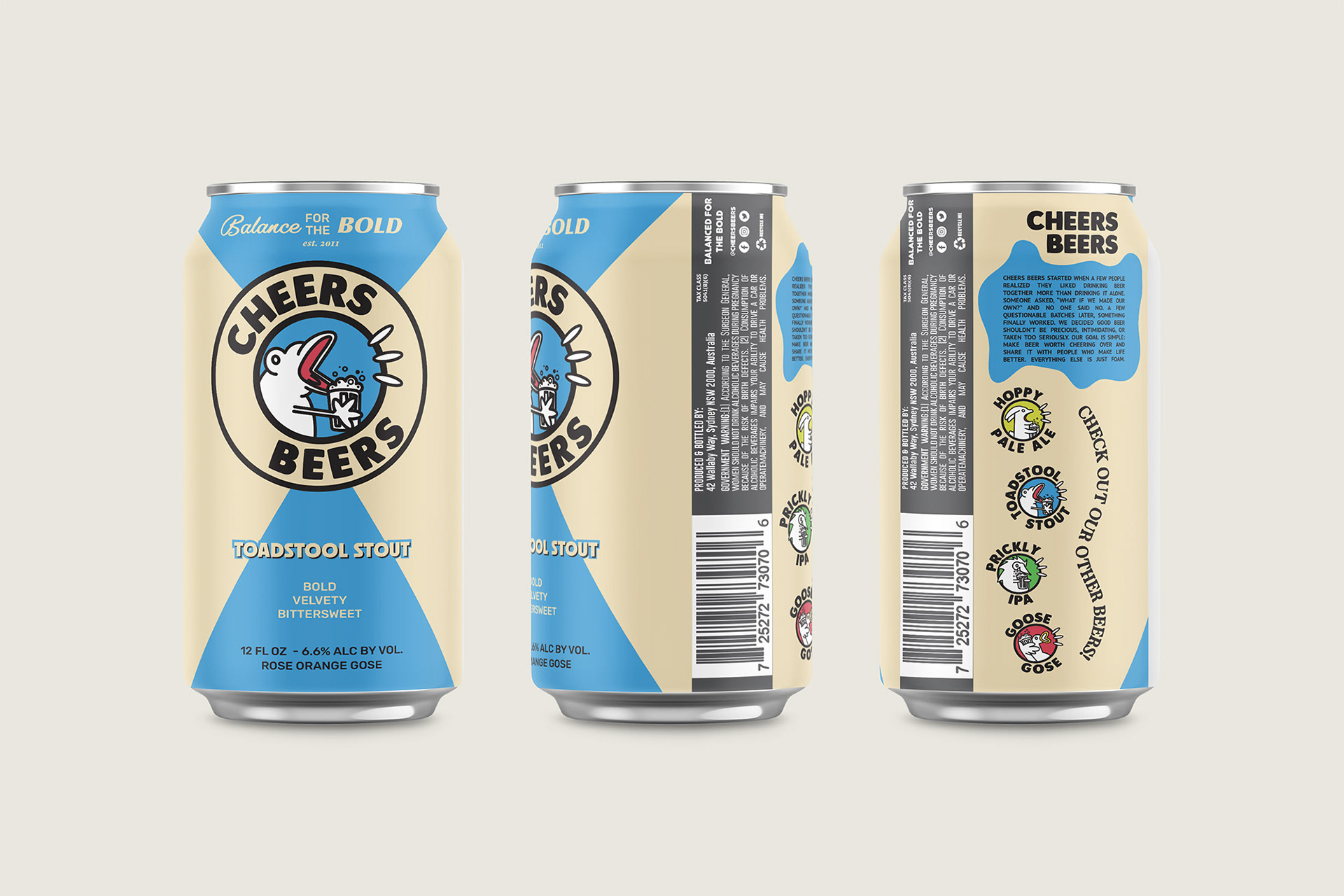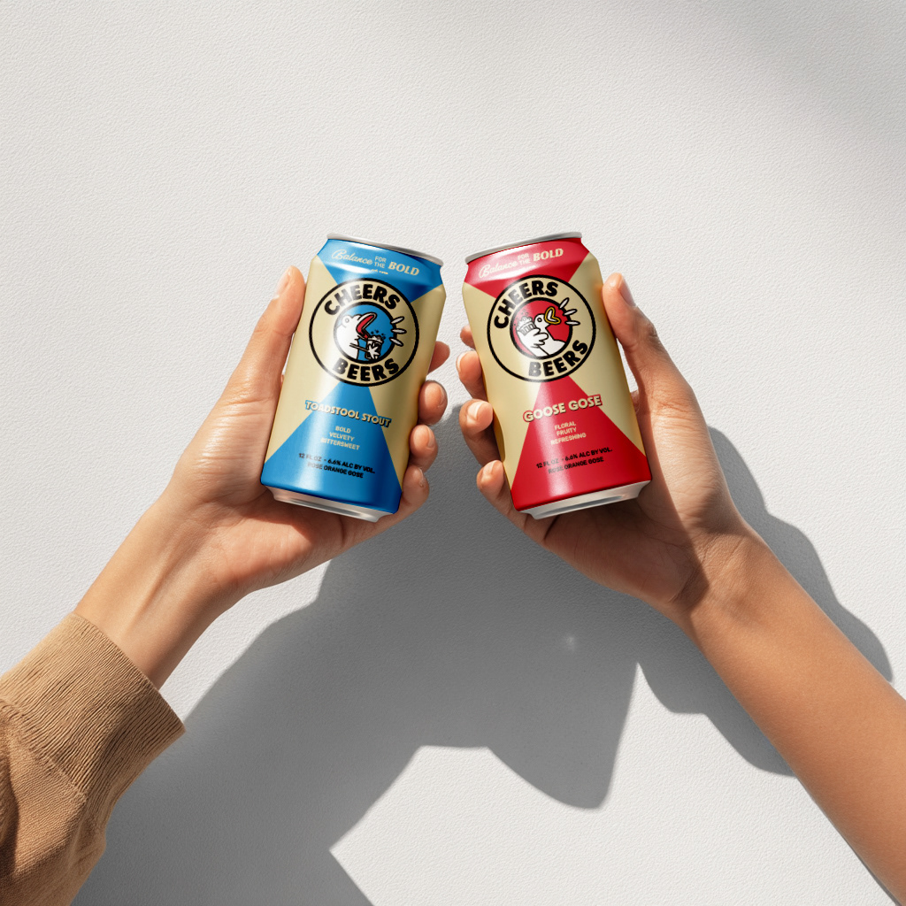
Cheers Beers
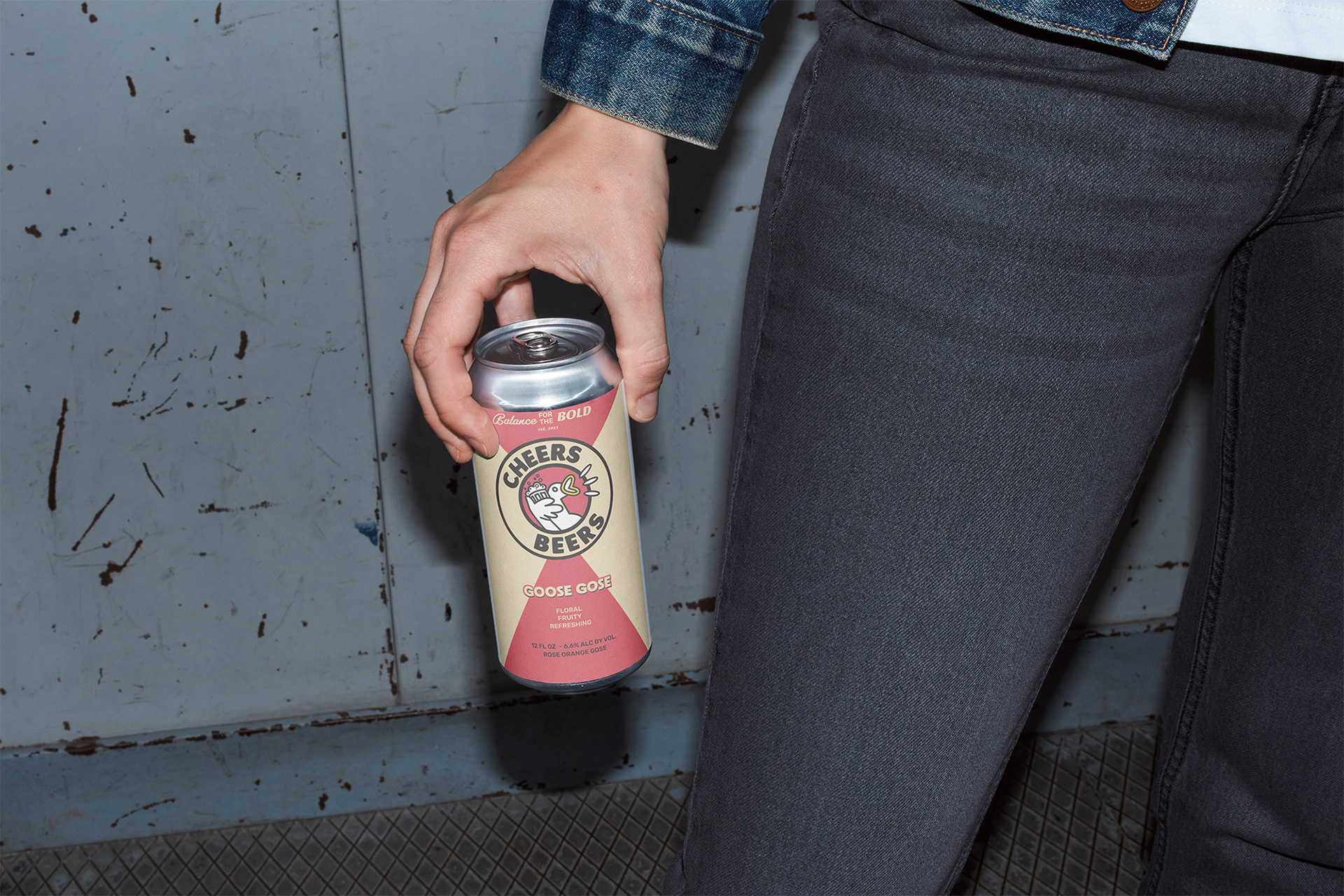
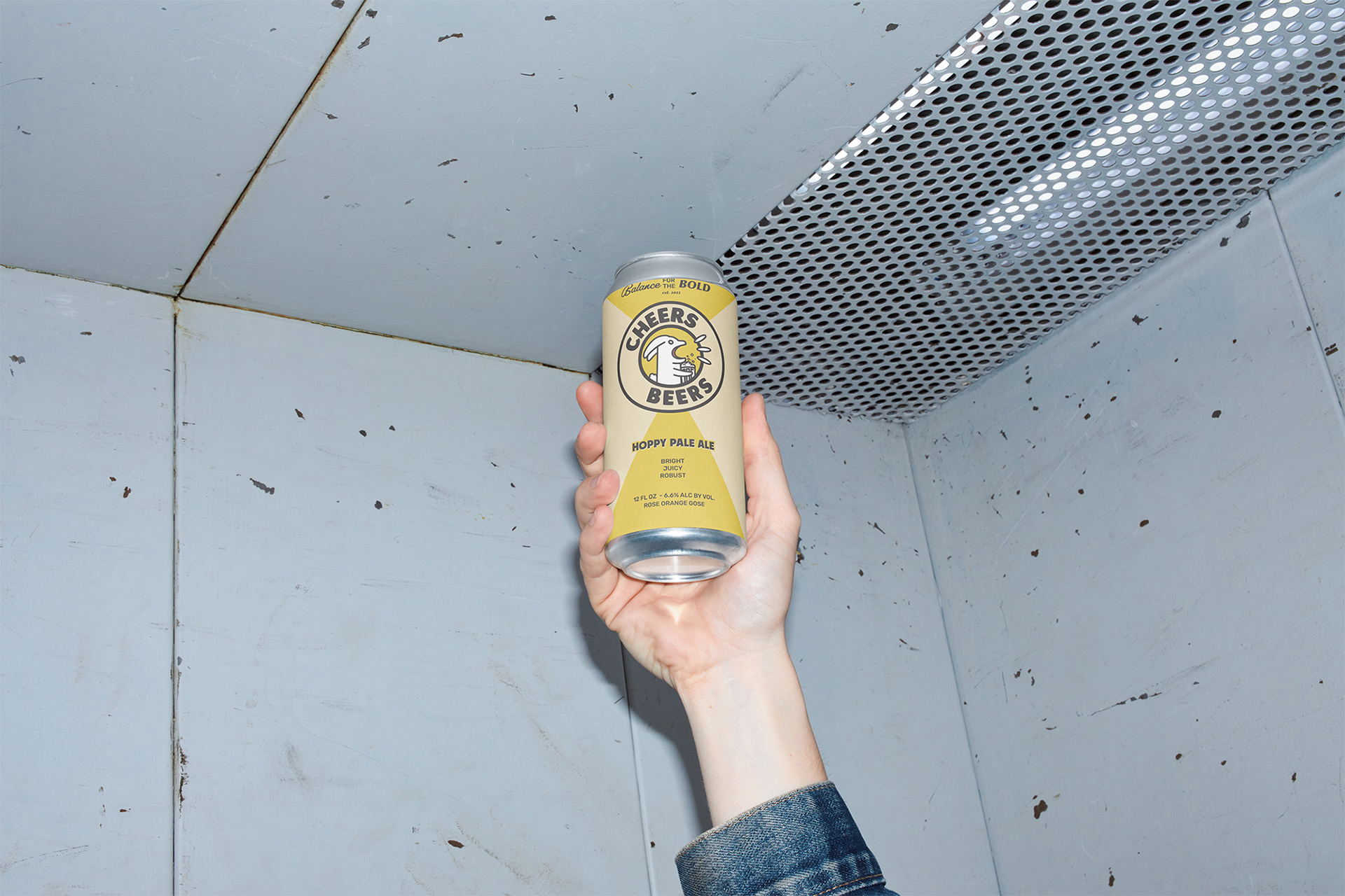
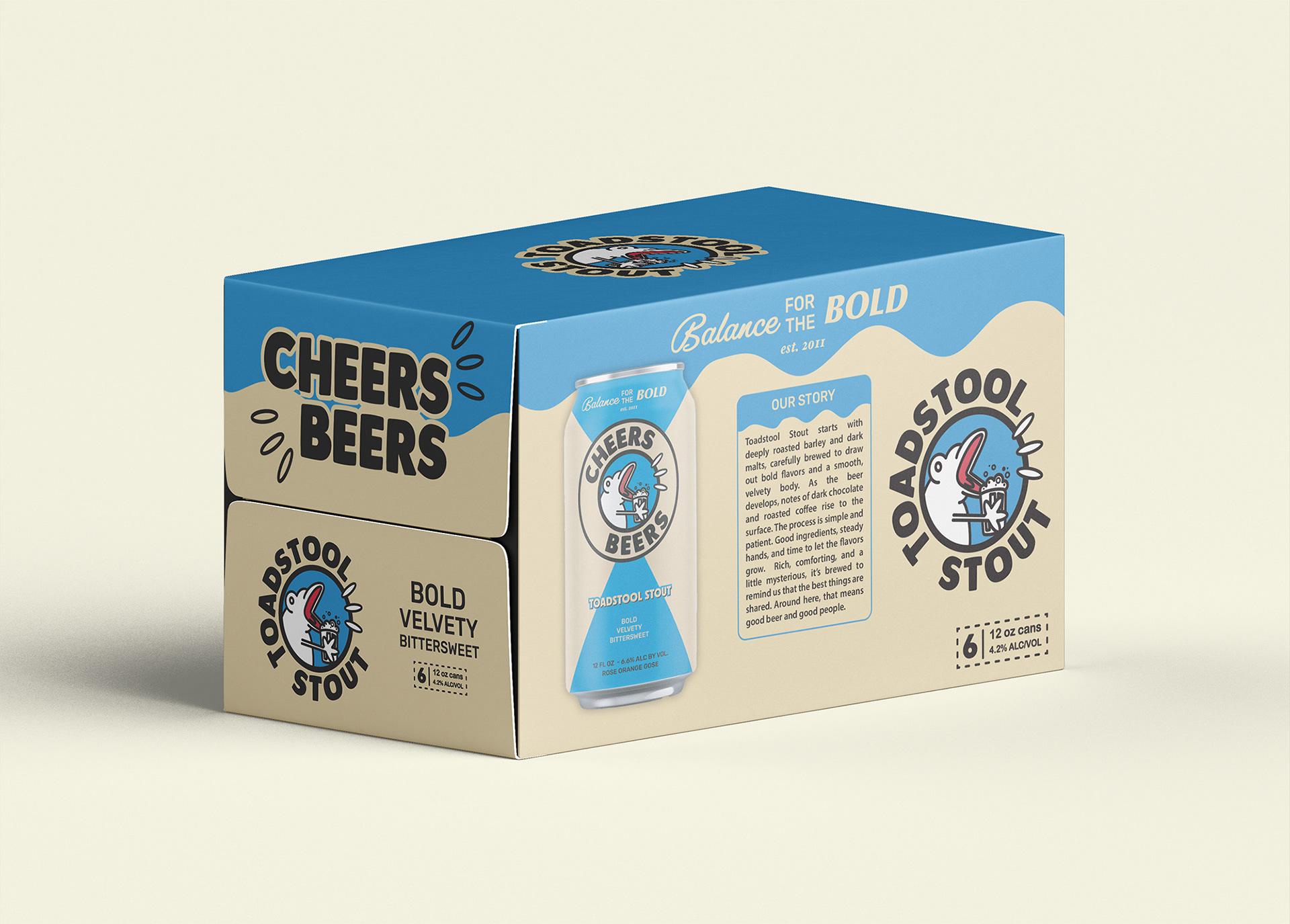
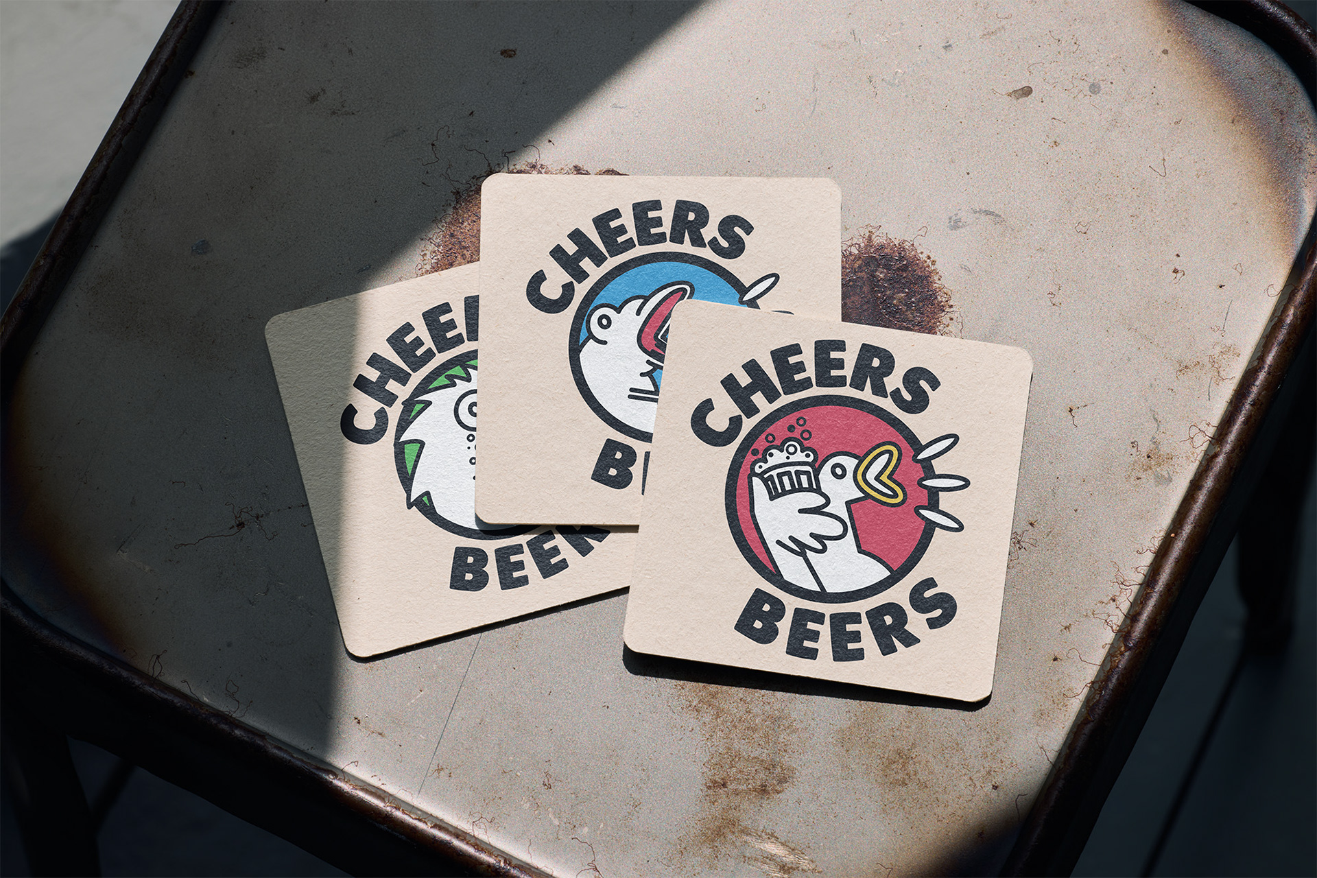
Ever needed a friend to drink with, but everyone’s busy? This can’s got you covered. It’s designed to keep you company or spark a conversation when you find yourself drinking with strangers.
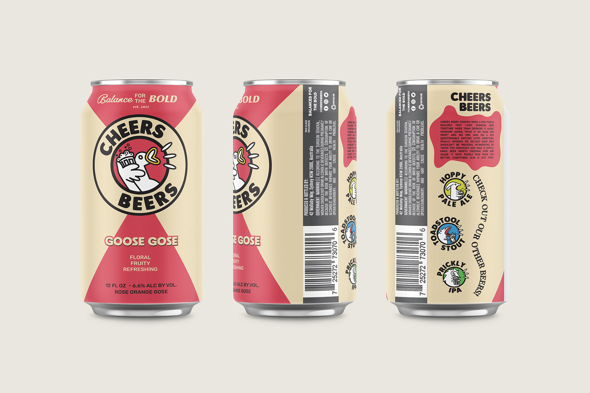
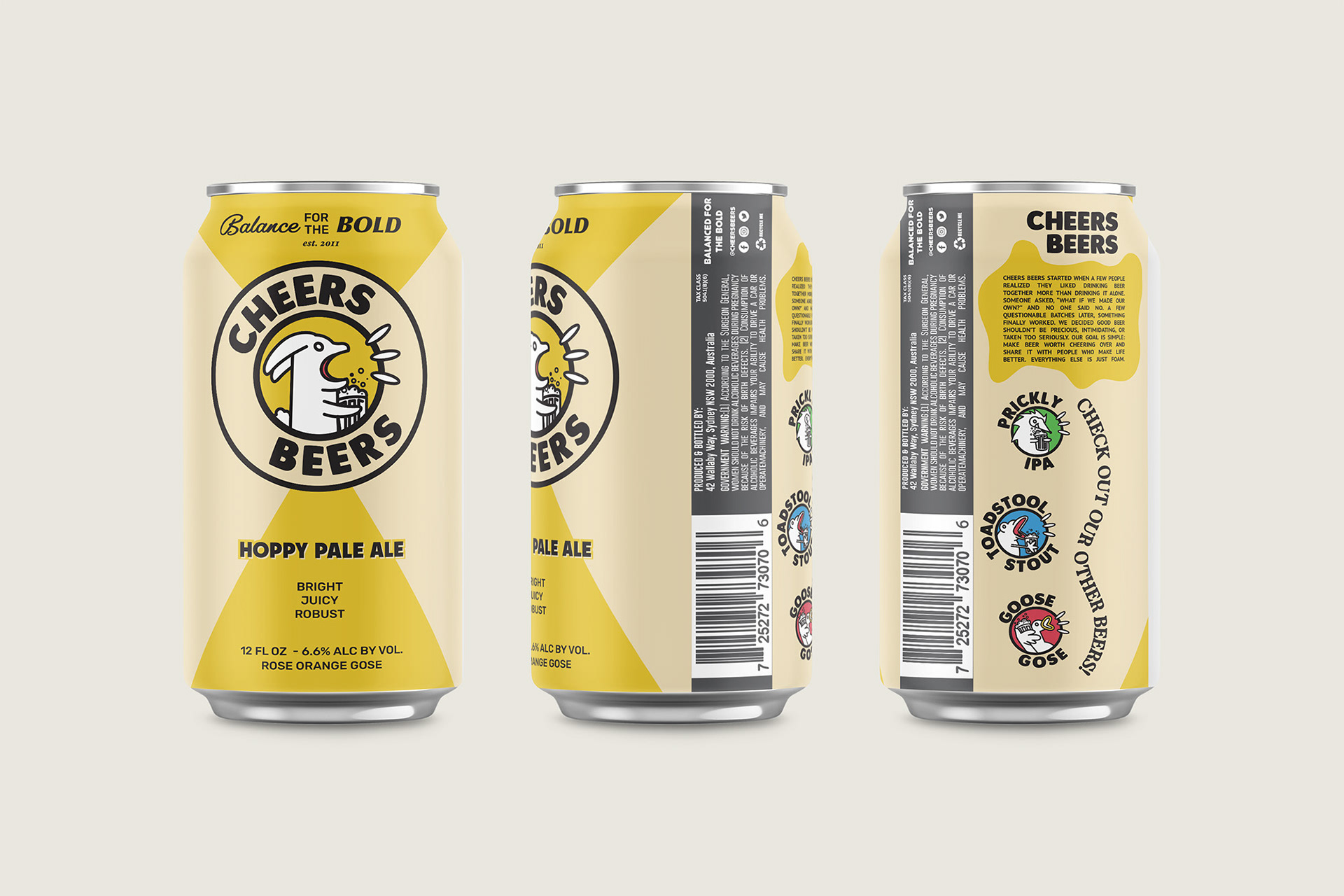
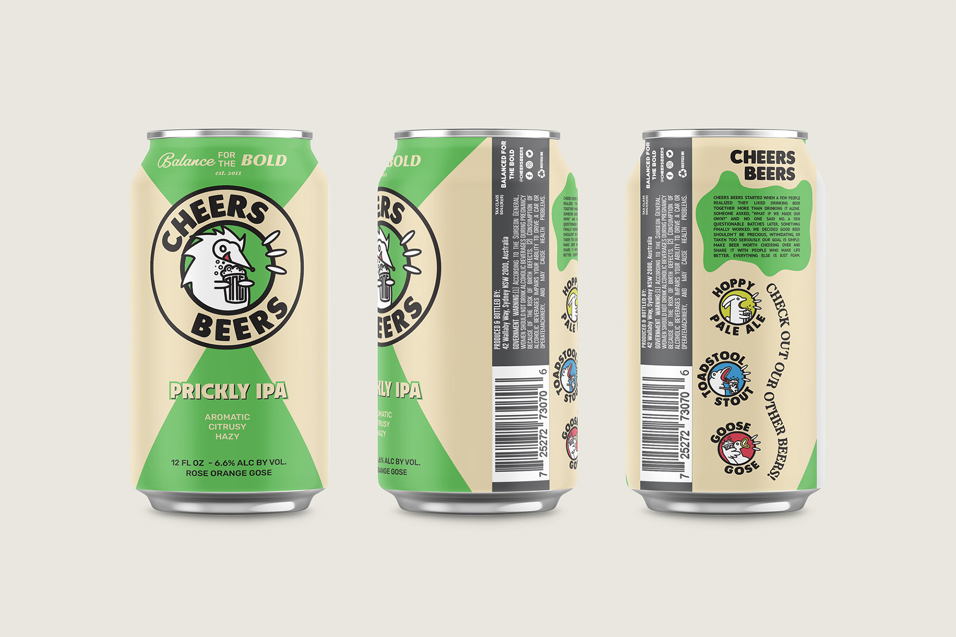
Each can features a unique character illustration with its own mood, color palette, and story.
Most beer labels lean heavily on typography. I wanted to flip that approach by creating something more playful and memorable.
Roles: Art Direction, Illustration, Logo Design, Branding